

Winter Wedding Cake Colours: A Guide to Getting Your Palette Right
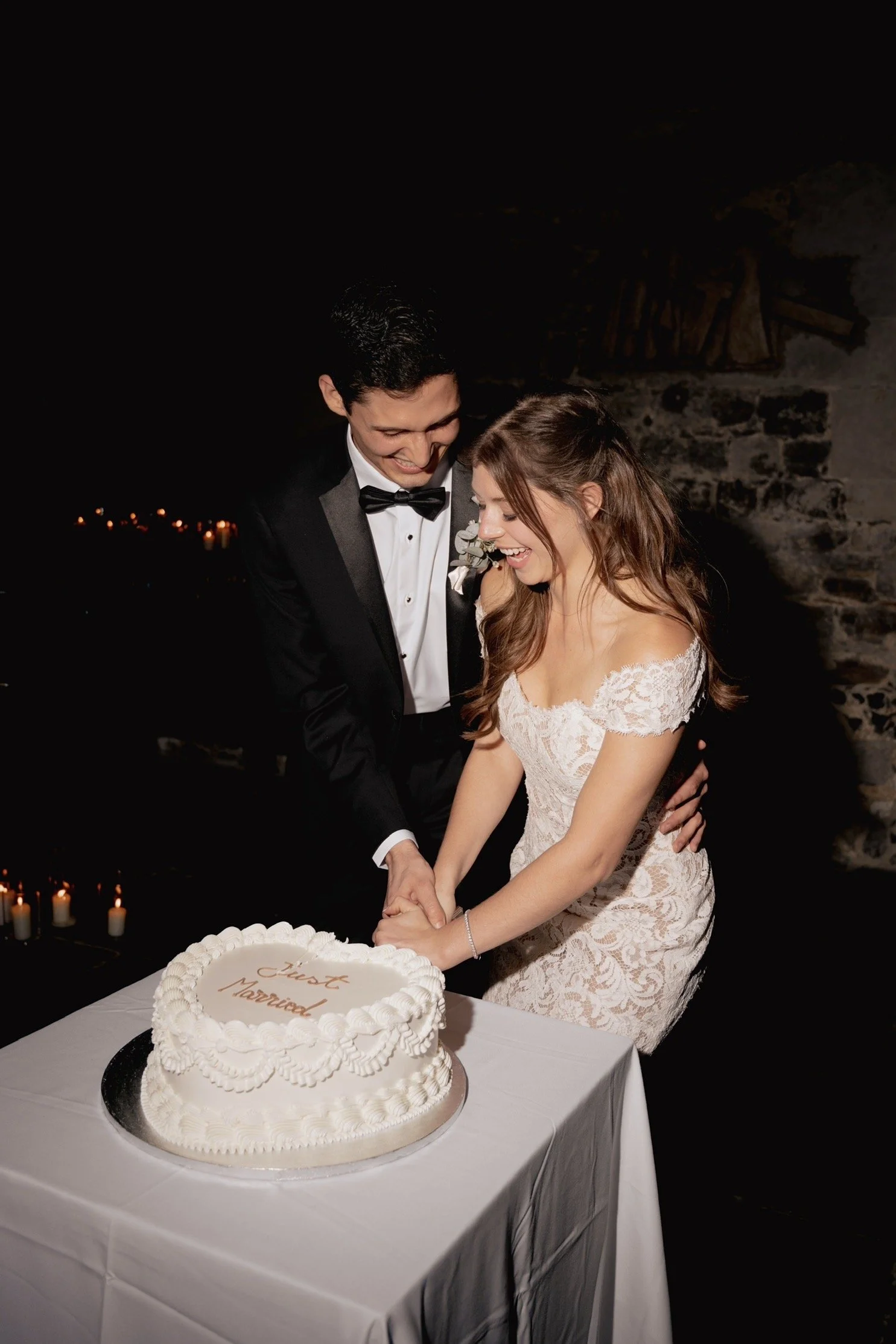
Choosing a colour for your wedding cake sounds like it should be one of the easier decisions. In practice, it is one of the ones couples spend the most time going back and forth on.
This guide is for anyone planning a winter wedding in London who wants to make a considered colour choice — not just pick something that looks nice on a screen, but understand what will actually work in the room, in the light, on the day.
Why Winter Wedding Cake Colours Deserve Their Own Conversation
The principles that apply to a summer or spring wedding cake palette do not transfer cleanly to winter.
In summer, the light is bright and even. Pastels pop. Pale tones hold up well against daylight and greenery. In winter, the light shifts. Venues lean on candlelight and warm artificial lighting, the backdrop is richer and often darker, and the overall aesthetic carries more weight and texture.
A colour that looks elegant on a mood board in July can read as washed out or disconnected once it is sitting on a table in a candlelit venue in December. Conversely, a tone that feels bold or risky in isolation can look exactly right in a winter setting.
Understanding that difference is the starting point for getting your winter wedding cake colours right.
The Tones That Tend to Work Well
There is no single correct palette for a winter wedding cake. What works depends on your venue, your overall colour scheme, and the mood you are going for. That said, certain tonal families consistently perform well in winter settings.
Warm ivories and off-whites. Not bright white, which can read cold in candlelight, but ivory with warmth to it — something closer to cream or cashmere. This is one of the most requested shades for winter cakes, and for good reason. It reads as deliberately warm rather than defaulting to neutral.
Deep greens. Forest green, sage with depth, dusty olive. Greens that have weight and richness to them suit winter particularly well, especially in venues with dark wood, stone, or warm lighting. Paired with white or ivory flowers, they feel considered and seasonal without leaning into anything overtly thematic.
Slate and charcoal. For couples who want drama without going fully dark, a well-mixed slate or cool grey can be extraordinary in candlelight. The key is in the finish — this tone works best with texture, not a flat or glossy surface.
Dusty berry and deep blush. Not the bright pinks of summer, but blush with depth, or a soft berry sitting closer to burgundy. These shades feel distinctly wintery without being heavy, and they photograph well in low light.
Champagne and pale bronze. Metallic-adjacent without being fully metallic. Champagne and warm bronze tones pick up candlelight in a way that feels genuinely luxurious. They work well as a full cake colour or as an accent against a paler base.
What Does Not Tend to Work — and Why
Bright, saturated colours are typically a difficult choice for winter venues. Not because they are not beautiful in other contexts, but because they can fight against a room that is already doing its own atmospheric work. When the venue is working with deep florals, low lighting, and rich textiles, a very bright or primary-toned cake can feel like it belongs somewhere else entirely.
Pastel shades can face a similar challenge. In good daylight they look soft and considered. In candlelight, without enough tonal depth, they can disappear — or worse, look slightly flat in photographs.
This is not to say these choices are wrong. Every venue is different, and some couples deliberately choose a pale or vivid tone to create contrast with the room. But if you are unsure, leaning toward tones with a little more weight will generally serve you better in a winter setting.
Finish Matters as Much as Colour
One thing that often gets overlooked in the colour conversation is the finish — how the cake surface is treated — and finish has an enormous effect on how a colour reads in the room.
A deep green in a smooth matte finish looks sleek and architectural. The same deep green in a textured palette knife finish looks organic and painterly, with more movement and warmth. Neither is better than the other, but they create entirely different impressions.
For winter wedding cakes in particular, textured finishes tend to perform very well. The way the surface catches and reflects light in a candlelit room adds a dimension that a flat finish simply does not have. If you are working with a richer or deeper colour, it is worth thinking about whether a textured application suits your vision.
Colour and Your Florals: Getting the Two to Work Together
Your cake will almost certainly sit near florals — whether arranged on the cake itself or as part of the surrounding display — and the relationship between cake colour and floral palette matters.
Tone-on-tone. Matching the cake colour closely to the dominant floral shade, so the whole arrangement reads as one considered piece. Deep green cake with deep green foliage and ivory flowers, for example.
Complementary contrast. Choosing a cake colour that sits opposite or adjacent to the floral palette, creating deliberate but harmonious contrast. Ivory cake with deep plum florals, or slate cake with warm blush roses.
Neutral base, colour in the florals. Keeping the cake in a warm ivory or champagne and letting the florals carry the colour entirely. This works especially well when the floral arrangement is a key design feature.
Whichever approach you take, bringing your floral palette, stationery, and fabric swatches to any colour conversations will make the decision considerably easier. Colour choices made in isolation rarely land as well as ones made with the full picture.
How Buttercream Takes Colour
Buttercream takes colour very well, including deep and complex tones. Where fondant at depth can look flat or slightly plastic, buttercream at depth tends to look richer and more natural. The subtle variation you often see across a hand-applied buttercream surface — particularly with a palette knife finish — gives the colour life and dimension that works especially well in winter settings.
If you want a very pale or very precise shade, that is achievable too. The conversation to have with your baker is about the exact tone and how the finishing technique will affect how it reads once it is made.
When to Have This Conversation
Colour is best decided as part of a broader design conversation, not in isolation. Once you have a clear sense of your venue, your floral palette, your overall mood, and the cake style you are drawn to, the colour choice tends to follow naturally.
If you are planning a winter wedding and are beginning to think about your cake, now is a good time to start. Winter dates in London — particularly November through January — fill up faster than most couples expect.